- Home
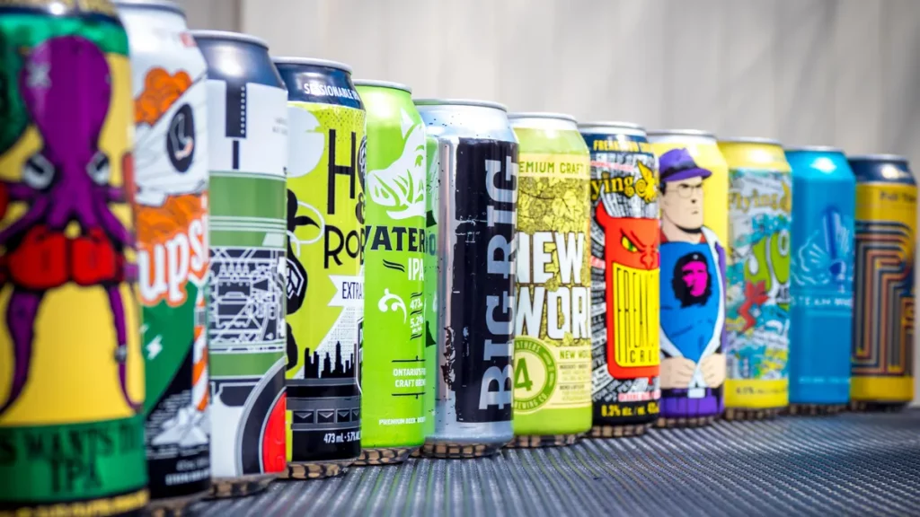
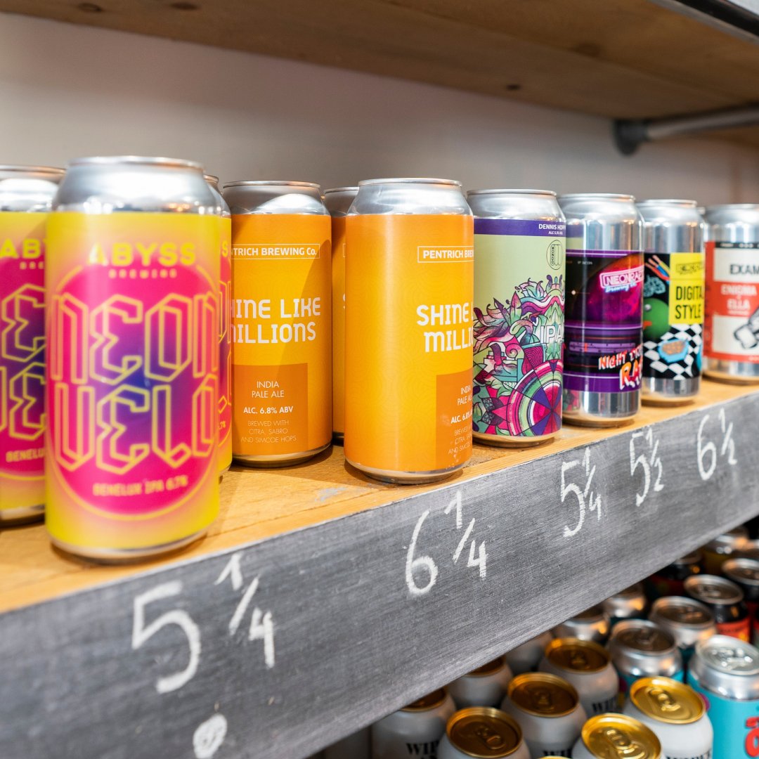
The colour of your packaging plays an integral role in the way consumers perceive your product. In fact, 85% of customers buy products based on colour alone. And yet, many companies overlook the importance of colour in their packaging design.
The colour palette you decide can be the difference-maker in whether or not your product stands out on the shelves. To ensure that potential customers are drawn to your product, it’s vital to consider the psychological effects of colours when designing your packaging.
Below, we’ll explore what consumer research has revealed about the impact of colours on consumers’ purchasing decisions.
The Psychology Behind Packaging Colours
People tend to react differently to different colours. However, there are overriding trends that exist across cultures driven by psychology.
For instance, research has uncovered that brighter colours tend to reduce the seriousness of packaging, grey or brown make the packaging conservative or masculine, pink adds a feminine touch, and red draws attention. Of course, all colours exist on a spectrum, and the shade, strength, and tone of the colour will also affect how it is perceived.
You can also use colours to create a certain mood or feeling. For instance, blue is often seen as trustworthy, green is associated with nature and relaxation, and black can convey sophistication.
Now that we understand the psychological effects of colours, let’s explore how you can use them to increase sales.
Choosing the Right Colours for Your Product’s Packaging
The colours you use on your packaging should be carefully chosen to target your desired audience. Consider the following:
- Who is your target market?
- What feeling do you want your product to evoke?
- What colours does your competition use?
- How do colours tend to be used in your category or market segment?
Don’t forget that you may also want your colour choices to physically represent your product. For instance, shampoo bottles and drinks products are often the same colour as their flavour (e.g. red for strawberries or green for mint).
You’ll also want to consider how your colours will look when printed on your packaging. For example, white text can be challenging to read on light-coloured packaging. By contrast, if you’re using a white background, make sure the colours you choose will show up clearly and contrast well.
Your packaging colours should also be chosen to complement each other. You’ll want to create a colour palette that is visually appealing and works together to achieve your desired mood or feeling.
Once you’ve considered these factors, you can begin to narrow down your choices. If you’re still unsure which colours to use, consider contacting a consumer research company with experience in this area.
Final Thoughts on the Impact of Colours in Packaging
The colours you use on your product’s packaging can significantly impact consumer perception. When choosing colours for your packaging, it’s important to consider the psychological effects of colours as well as the current trends in your industry. It’s also crucial to ensure that your colours work well together and complement each other.
If you’re a startup brand or an established market force looking to test and trail packaging ideas, speak to us about how we can help.
At WSS, we understand the importance of colours in packaging design. We can help you create packaging research projects that will test your hypotheses and deliver the insights you need to make informed decisions about your product’s packaging.
From choosing colours that attract the most attention on supermarket shelves to those that convey the right message about your product, we can design and execute packaging research and focus group studies that will help you achieve your desired objectives.
To learn more about how we can help, contact us today on +44 (0)151 346 2999 or via email at info@wssintl.com.